RSM338: Machine Learning in Finance

Week 4: Clustering | January 28–29, 2026

Kevin Mott

Rotman School of Management

Today’s Goal

This week we learn our first unsupervised learning technique: clustering.

The problem: Given a set of objects (stocks, countries, customers), can we group them into meaningful clusters based on their characteristics?

Today’s roadmap:

  1. What is clustering? Unsupervised learning and why it matters
  2. Measuring similarity: How do we decide if two objects are “close”?
  3. K-Means clustering: The workhorse algorithm
  4. Choosing K: How many clusters should we use?
  5. Hierarchical clustering: An alternative approach with dendrograms

Part I: What is Clustering?

Supervised vs Unsupervised Learning

Recall from Week 3:

Supervised learning: We have labeled data—we know the “right answer” for each observation.

  • Regression: predict a continuous \(y\) (e.g., stock returns)
  • Classification: predict a categorical \(y\) (e.g., default/no default)

Unsupervised learning: We have no labels—we’re looking for structure in the data itself.

  • Clustering: group similar observations together
  • Dimensionality reduction: find underlying patterns (e.g., PCA)

Clustering asks: Can we discover natural groupings in the data without being told what to look for?

What is Clustering?

Goal: Group objects into subsets (clusters) so that:

  • Objects within a cluster are similar to each other
  • Objects in different clusters are dissimilar
import numpy as np
import matplotlib.pyplot as plt
from sklearn.datasets import make_blobs

# Generate clustered data
np.random.seed(42)
X, y = make_blobs(n_samples=150, centers=3, cluster_std=0.8)

fig, axes = plt.subplots(1, 2)

# Before clustering
axes[0].scatter(X[:, 0], X[:, 1])
axes[0].set_title('Raw data: Can you see groups?')
axes[0].set_xlabel('Feature 1')
axes[0].set_ylabel('Feature 2')

# After clustering (colored by true cluster)
axes[1].scatter(X[:, 0], X[:, 1], c=y)
axes[1].set_title('After clustering: Groups revealed')
axes[1].set_xlabel('Feature 1')
axes[1].set_ylabel('Feature 2')

plt.tight_layout()
plt.show()

The algorithm’s job is to find these groups automatically.

Why Clustering in Finance?

Customer segmentation:

  • Group clients by trading behavior, risk tolerance, portfolio characteristics
  • Tailor products and services to each segment

Stock classification:

  • Group stocks by return patterns, volatility, sector characteristics
  • Find “peer groups” for relative valuation

Country risk assessment:

  • Cluster countries by economic indicators
  • Identify which countries share similar risk profiles

Regime detection:

  • Identify different “market states” (bull, bear, high volatility, etc.)
  • Adapt trading strategies to the current regime

Finance Example: Country Risk

Suppose we want to cluster 122 countries based on their “riskiness” for foreign investment.

We have 4 risk measures for each country:

Measure Source What it captures
GDP growth rate IMF Economic health
Corruption index Transparency International Institutional quality
Peace index Institute for Economics and Peace Political stability
Legal risk index Property Rights Association Rule of law

Each country is described by a vector of 4 numbers: \(\mathbf{x}_i = (x_{i1}, x_{i2}, x_{i3}, x_{i4})\)

Clustering will group countries with similar risk profiles together.

Describing Objects with Features

In clustering, each object is described by a set of features (also called attributes or variables).

Notation: Object \(i\) has \(p\) features:

\[\mathbf{x}_i = (x_{i1}, x_{i2}, \ldots, x_{ip})\]

where \(x_{ij}\) is the value of feature \(j\) for object \(i\).

Examples:

  • Stock: \(\mathbf{x}_i = (\text{avg return}, \text{volatility}, \text{beta}, \text{market cap})\)
  • Country: \(\mathbf{x}_i = (\text{GDP growth}, \text{corruption}, \text{peace index}, \text{legal risk})\)
  • Customer: \(\mathbf{x}_i = (\text{age}, \text{income}, \text{trade frequency}, \text{portfolio size})\)

We can think of each object as a point in \(p\)-dimensional space.

Part II: Measuring Similarity

How Do We Measure “Closeness”?

To cluster objects, we need to quantify how similar (or dissimilar) two objects are.

We typically measure distance—smaller distance means more similar.

The question: If object \(i\) has features \(\mathbf{x}_i = (x_{i1}, x_{i2}, \ldots, x_{ip})\) and object \(j\) has features \(\mathbf{x}_j = (x_{j1}, x_{j2}, \ldots, x_{jp})\), how far apart are they?

We need a function \(d(\mathbf{x}_i, \mathbf{x}_j)\) that tells us the distance between any two objects.

Euclidean Distance

The most common choice is Euclidean distance—the “straight line” distance you learned in geometry.

In 2 dimensions (two features):

\[d(\mathbf{x}_i, \mathbf{x}_j) = \sqrt{(x_{i1} - x_{j1})^2 + (x_{i2} - x_{j2})^2}\]

This is just the Pythagorean theorem!

fig, ax = plt.subplots()
# Two points
p1 = np.array([1, 2])
p2 = np.array([4, 6])

# Plot points
ax.scatter([p1[0], p2[0]], [p1[1], p2[1]], s=100)
ax.annotate('$\\mathbf{x}_i = (1, 2)$', p1, xytext=(p1[0]-0.8, p1[1]-0.5))
ax.annotate('$\\mathbf{x}_j = (4, 6)$', p2, xytext=(p2[0]+0.1, p2[1]+0.3))

# Draw the distance line
ax.plot([p1[0], p2[0]], [p1[1], p2[1]], 'k--')

# Draw the right triangle
ax.plot([p1[0], p2[0]], [p1[1], p1[1]], 'b:')
ax.plot([p2[0], p2[0]], [p1[1], p2[1]], 'b:')
ax.text(2.5, 1.5, '$\\Delta x_1 = 3$')
ax.text(4.2, 4, '$\\Delta x_2 = 4$')
ax.text(2, 4.5, '$d = 5$')

ax.set_xlabel('Feature 1')
ax.set_ylabel('Feature 2')
ax.set_title('Euclidean distance: $\\sqrt{3^2 + 4^2} = 5$')
ax.set_xlim(0, 6)
ax.set_ylim(0, 8)
plt.show()

Euclidean Distance: General Formula

In \(p\) dimensions (with \(p\) features), Euclidean distance generalizes to:

\[d(\mathbf{x}_i, \mathbf{x}_j) = \sqrt{\sum_{k=1}^{p} (x_{ik} - x_{jk})^2}\]

Here \(i\) and \(j\) index the two objects, and \(k\) indexes the features (from 1 to \(p\)).

In words: take the difference in each feature, square it, sum them all up, then take the square root.

Using vectors (from Week 1):

\[d(\mathbf{x}_i, \mathbf{x}_j) = \|\mathbf{x}_i - \mathbf{x}_j\|\]

where \(\|\cdot\|\) denotes the Euclidean norm (length) of a vector.

import numpy as np

# Two countries with 4 risk measures each
country_A = np.array([2.1, 45, 1.8, 60])  # (GDP growth, corruption, peace, legal)
country_B = np.array([3.5, 72, 2.1, 45])

# Euclidean distance
distance = np.sqrt(np.sum((country_A - country_B)**2))
print(f"Distance between countries: {distance:.2f}")

# Shortcut using numpy
distance_np = np.linalg.norm(country_A - country_B)
print(f"Using np.linalg.norm: {distance_np:.2f}")
Distance between countries: 30.92
Using np.linalg.norm: 30.92

The Problem with Raw Features: Scale

Consider clustering countries by GDP growth (in %) and GDP level (in billions $).

  • GDP growth ranges from -5% to +10%
  • GDP level ranges from $1B to $20,000B

If we compute Euclidean distance on raw values, GDP level will completely dominate!

A difference of $100B in GDP will swamp a difference of 5% in growth rate.

# Raw features (growth %, GDP in billions)
country_A = np.array([2.0, 500])    # 2% growth, $500B GDP
country_B = np.array([7.0, 510])    # 7% growth, $510B GDP
country_C = np.array([2.5, 5000])   # 2.5% growth, $5000B GDP

# Distances from A
d_AB = np.linalg.norm(country_A - country_B)
d_AC = np.linalg.norm(country_A - country_C)

print(f"Distance A to B: {d_AB:.1f}")
print(f"Distance A to C: {d_AC:.1f}")
print("B is 'closer' to A despite very different growth rates!")
Distance A to B: 11.2
Distance A to C: 4500.0
B is 'closer' to A despite very different growth rates!

The Solution: Standardization

Before clustering, we standardize (or normalize) each feature to have mean 0 and standard deviation 1.

For each feature \(j\), compute:

\[z_{ij} = \frac{x_{ij} - \bar{x}_j}{s_j}\]

where:

  • \(\bar{x}_j\) is the mean of feature \(j\) across all objects
  • \(s_j\) is the standard deviation of feature \(j\)

This puts all features on the same scale—a 1-unit difference in any standardized feature represents “one standard deviation.”

from sklearn.preprocessing import StandardScaler

# Stack countries into a matrix
X = np.array([[2.0, 500], [7.0, 510], [2.5, 5000]])

# Standardize
scaler = StandardScaler()
X_scaled = scaler.fit_transform(X)

print("Standardized features:")
print(X_scaled)
Standardized features:
[[-0.81537425 -0.70946511]
 [ 1.4083737  -0.70474583]
 [-0.59299945  1.41421094]]

After Standardization

# Now compute distances on standardized features
d_AB_scaled = np.linalg.norm(X_scaled[0] - X_scaled[1])
d_AC_scaled = np.linalg.norm(X_scaled[0] - X_scaled[2])

print(f"Distance A to B (standardized): {d_AB_scaled:.2f}")
print(f"Distance A to C (standardized): {d_AC_scaled:.2f}")
print("Now B is farther from A (very different growth rates matter!)")
Distance A to B (standardized): 2.22
Distance A to C (standardized): 2.14
Now B is farther from A (very different growth rates matter!)

Visualizing the Effect of Standardization

fig, axes = plt.subplots(1, 2)

# Raw data
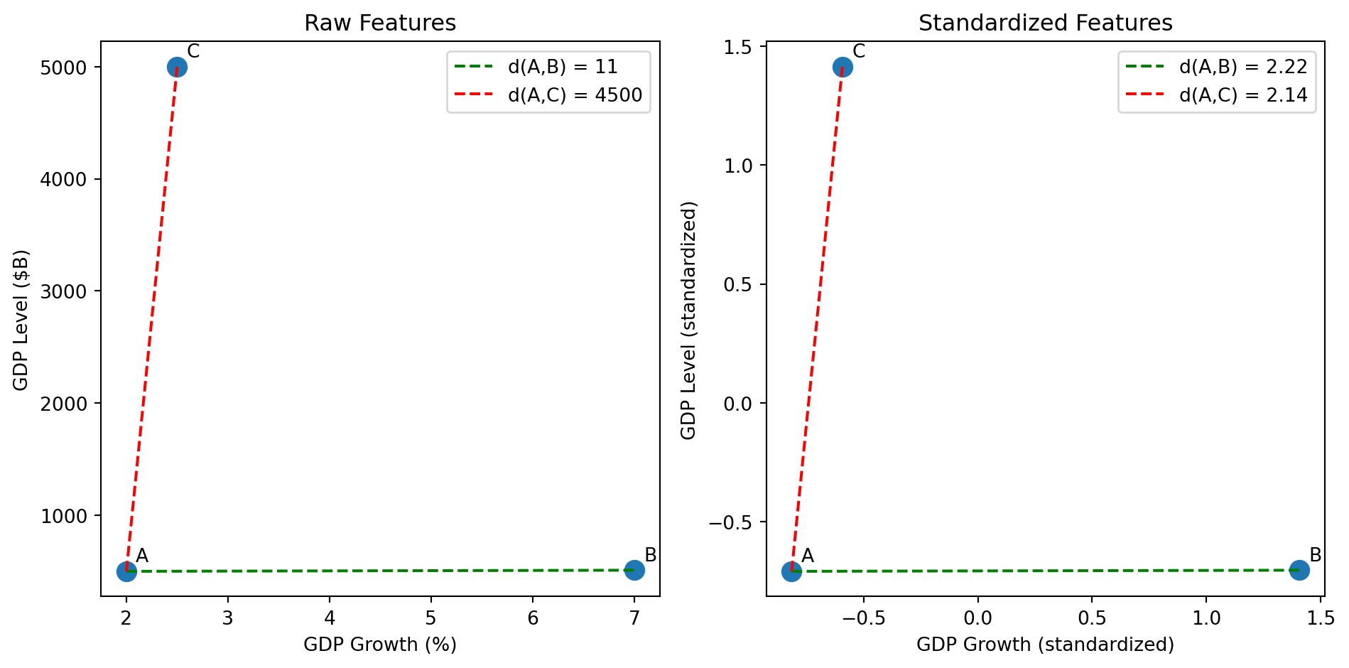
X_raw = np.array([[2.0, 500], [7.0, 510], [2.5, 5000]])
labels = ['A', 'B', 'C']

# Compute raw distances
d_AB_raw = np.linalg.norm(X_raw[0] - X_raw[1])
d_AC_raw = np.linalg.norm(X_raw[0] - X_raw[2])

# Compute standardized distances
d_AB_std = np.linalg.norm(X_scaled[0] - X_scaled[1])
d_AC_std = np.linalg.norm(X_scaled[0] - X_scaled[2])

# Left plot: Raw features
axes[0].scatter(X_raw[:, 0], X_raw[:, 1], s=100)
for i, label in enumerate(labels):
    axes[0].annotate(label, X_raw[i], xytext=(5, 5), textcoords='offset points')
# Draw lines between pairs
axes[0].plot([X_raw[0, 0], X_raw[1, 0]], [X_raw[0, 1], X_raw[1, 1]], 'g--', label=f'd(A,B) = {d_AB_raw:.0f}')
axes[0].plot([X_raw[0, 0], X_raw[2, 0]], [X_raw[0, 1], X_raw[2, 1]], 'r--', label=f'd(A,C) = {d_AC_raw:.0f}')
axes[0].set_xlabel('GDP Growth (%)')
axes[0].set_ylabel('GDP Level ($B)')
axes[0].set_title('Raw Features')
axes[0].legend()

# Right plot: Standardized features
axes[1].scatter(X_scaled[:, 0], X_scaled[:, 1], s=100)
for i, label in enumerate(labels):
    axes[1].annotate(label, X_scaled[i], xytext=(5, 5), textcoords='offset points')
# Draw lines between pairs
axes[1].plot([X_scaled[0, 0], X_scaled[1, 0]], [X_scaled[0, 1], X_scaled[1, 1]], 'g--', label=f'd(A,B) = {d_AB_std:.2f}')
axes[1].plot([X_scaled[0, 0], X_scaled[2, 0]], [X_scaled[0, 1], X_scaled[2, 1]], 'r--', label=f'd(A,C) = {d_AC_std:.2f}')
axes[1].set_xlabel('GDP Growth (standardized)')
axes[1].set_ylabel('GDP Level (standardized)')
axes[1].set_title('Standardized Features')
axes[1].legend()

plt.tight_layout()
plt.show()

Left (raw): A and C appear far apart, A and B appear close—but this is misleading because GDP level dominates.

Right (standardized): Now d(A,B) > d(A,C) because A and B have very different growth rates (2% vs 7%), while A and C have similar growth (2% vs 2.5%).

Warning

Always standardize your features before clustering (unless you have a good reason not to). Most clustering algorithms assume features are on comparable scales.

Part III: K-Means Clustering

The K-Means Algorithm

K-Means is the most widely used clustering algorithm. The “K” refers to the number of clusters.

Input:

  • Data: \(n\) objects, each with \(p\) features
  • Number of clusters: \(K\) (you choose this)

Output:

  • Cluster assignments: which cluster each object belongs to
  • Cluster centers: the “average” location of each cluster

Goal: Assign each object to a cluster so that objects are close to their cluster center.

The K-Means Problem: Formal Statement

We have \(n\) objects with feature vectors \(\mathbf{x}_1, \mathbf{x}_2, \ldots, \mathbf{x}_n\) where each \(\mathbf{x}_i \in \mathbb{R}^p\).

Decision variables:

  • Cluster assignments: \(C(i) \in \{1, 2, \ldots, K\}\) for each object \(i\)
  • Cluster centroids: \(\boldsymbol{\mu}_1, \boldsymbol{\mu}_2, \ldots, \boldsymbol{\mu}_K\) where each \(\boldsymbol{\mu}_k \in \mathbb{R}^p\)

Objective: Minimize the within-cluster sum of squares (WCSS):

\[\min_{\{C(i)\}, \{\boldsymbol{\mu}_k\}} \sum_{k=1}^{K} \sum_{i: C(i) = k} \|\mathbf{x}_i - \boldsymbol{\mu}_k\|^2\]

In words: choose assignments and centroids to minimize the total squared distance from each object to its assigned centroid.

Understanding the Objective

Let’s unpack \(\displaystyle\sum_{k=1}^{K} \sum_{i: C(i) = k} \|\mathbf{x}_i - \boldsymbol{\mu}_k\|^2\):

  • Outer sum \(\sum_{k=1}^{K}\): loop over each cluster \(k = 1, 2, \ldots, K\)

  • Inner sum \(\sum_{i: C(i) = k}\): for cluster \(k\), loop over all objects \(i\) assigned to that cluster

  • Squared distance \(\|\mathbf{x}_i - \boldsymbol{\mu}_k\|^2\): how far is object \(i\) from centroid \(k\)?

Expanding the squared norm (using Week 1):

\[\|\mathbf{x}_i - \boldsymbol{\mu}_k\|^2 = \sum_{j=1}^{p} (x_{ij} - \mu_{kj})^2\]

This is the squared Euclidean distance between object \(i\) and centroid \(k\).

K-Means: The Intuition

Imagine you want to place \(K\) “representative points” (called centroids) in your data space.

Each object gets assigned to whichever centroid is closest.

The algorithm finds centroid locations that minimize the total distance from each object to its assigned centroid.

from sklearn.cluster import KMeans

# Generate data
np.random.seed(42)
X, _ = make_blobs(n_samples=150, centers=3, cluster_std=1.0)

# Fit K-Means
kmeans = KMeans(n_clusters=3, random_state=42, n_init=10)
kmeans.fit(X)
labels = kmeans.labels_
centers = kmeans.cluster_centers_

fig, ax = plt.subplots()
ax.scatter(X[:, 0], X[:, 1], c=labels)
ax.scatter(centers[:, 0], centers[:, 1], c='red', marker='X', s=200, edgecolors='black')
ax.set_xlabel('Feature 1')
ax.set_ylabel('Feature 2')
ax.set_title('K-Means with K=3: Red X marks the centroids')
plt.show()

K-Means: The Algorithm

The algorithm alternates between two steps:

Step 1: Assign each object to the nearest centroid.

Step 2: Update each centroid to be the mean of all objects assigned to it.

Repeat until the assignments stop changing.

More precisely:

  1. Initialize: Pick \(K\) random objects as initial centroids
  2. Assign: For each object \(i\), find the closest centroid and assign \(i\) to that cluster
  3. Update: For each cluster \(k\), compute the new centroid as the mean of all objects in cluster \(k\)
  4. Repeat steps 2-3 until convergence (assignments don’t change)

K-Means: Visualizing the Iterations

# Generate synthetic data with 3 natural clusters
np.random.seed(42)
X, _ = make_blobs(n_samples=100, centers=3, cluster_std=1.2)

fig, axes = plt.subplots(2, 3)
axes = axes.flatten()

# INITIALIZE: pick 3 random data points as starting centroids
np.random.seed(123)
centroid_idx = np.random.choice(len(X), 3, replace=False)
centroids = X[centroid_idx].copy()

for iteration in range(6):
    ax = axes[iteration]

    # STEP 1 (Assign): compute distance from each point to each centroid,
    # then assign each point to its nearest centroid
    distances = np.sqrt(((X[:, np.newaxis] - centroids)**2).sum(axis=2))
    labels = distances.argmin(axis=1)

    # Plot current state
    ax.scatter(X[:, 0], X[:, 1], c=labels)
    ax.scatter(centroids[:, 0], centroids[:, 1], c='red', marker='X', s=150, edgecolors='black')
    ax.set_title(f'Iteration {iteration + 1}')
    ax.set_xticks([])
    ax.set_yticks([])

    # STEP 2 (Update): move each centroid to the mean of its assigned points
    new_centroids = np.array([X[labels == k].mean(axis=0) for k in range(3)])
    centroids = new_centroids

plt.tight_layout()
plt.show()

Watch how the centroids move to the “center” of their assigned points, and assignments stabilize.

Note

This manual implementation is for illustration only—you won’t be asked to code K-means from scratch. But as with all algorithms in this course, you should understand intuitively what’s happening in the background, its strengths and weaknesses, and how to describe good use cases.

Why the Algorithm Works

Recall the K-Means objective: \(\displaystyle\min_{\{C(i)\}, \{\boldsymbol{\mu}_k\}} \sum_{k=1}^{K} \sum_{i: C(i) = k} \|\mathbf{x}_i - \boldsymbol{\mu}_k\|^2\)

The algorithm solves this by alternating between two sub-problems:

Fixing centroids, optimize assignments:

Given centroids \(\boldsymbol{\mu}_1, \ldots, \boldsymbol{\mu}_K\), the best assignment for object \(i\) is the nearest centroid: \[C(i) = \arg\min_{k} \|\mathbf{x}_i - \boldsymbol{\mu}_k\|^2\]

Fixing assignments, optimize centroids:

Given assignments, the best centroid for cluster \(k\) is the mean of its members: \[\boldsymbol{\mu}_k = \frac{1}{n_k} \sum_{i: C(i) = k} \mathbf{x}_i\]

where \(n_k\) is the number of objects in cluster \(k\).

Each step decreases (or maintains) the objective, so the algorithm converges.

K-Means in Python: Clustering Stocks by Characteristics

Let’s apply K-means to a finance problem: can we cluster stocks based on financial characteristics, and do the resulting clusters correspond to something meaningful (like sector)?

We’ll deliberately pick an extreme example to illustrate the method clearly. We select 20 stocks from two very different sectors:

Sector Stocks Typical Characteristics
Utilities NEE, DUK, SO, D, AEP, EXC, SRE, XEL, PEG, WEC Low beta, high dividend yield (defensive, income-focused)
Technology AAPL, MSFT, NVDA, GOOGL, META, AVGO, AMD, CRM, ADBE, NOW High beta, low dividend yield (growth-focused, volatile)

We use two features for clustering:

  • Beta: measures sensitivity to market movements (utilities tend to have low beta ~0.5, tech tends to have high beta ~1.2+)
  • Dividend yield: percentage of stock price paid as dividends (utilities ~3-4%, tech ~0-1%)

Beta and dividend yield are pulled from Yahoo Finance via yfinance (data cached January 6, 2025).

Warning

This example is intentionally clean. We picked two sectors that are almost opposites in terms of risk and income characteristics. Real-world clustering problems are messier—clusters may not align neatly with any known category, and interpreting what the clusters “mean” requires judgment.

Step 1: Pull and Cache the Data

We first pull the data from Yahoo Finance. To avoid hitting the API repeatedly, we cache the results to a CSV file.

import os
import pandas as pd
import yfinance as yf
from time import sleep

# Tickers: 10 Utilities + 10 Tech
TICKERS = {
    # Utilities
    "NEE": "Utilities", "DUK": "Utilities", "SO": "Utilities", "D": "Utilities", "AEP": "Utilities",
    "EXC": "Utilities", "SRE": "Utilities", "XEL": "Utilities", "PEG": "Utilities", "WEC": "Utilities",
    # Tech
    "AAPL": "Technology", "MSFT": "Technology", "NVDA": "Technology", "GOOGL": "Technology", "META": "Technology",
    "AVGO": "Technology", "AMD": "Technology", "CRM": "Technology", "ADBE": "Technology", "NOW": "Technology",
}

DATA_FILE = "stock_cluster_data.csv"

# Only pull from API if we don't have the data cached
if os.path.exists(DATA_FILE):
    print(f"Loading cached data from {DATA_FILE}")
    stocks_df = pd.read_csv(DATA_FILE)
else:
    print("Pulling data from yfinance (this takes ~30 seconds)...")
    records = []
    for ticker, sector in TICKERS.items():
        try:
            info = yf.Ticker(ticker).info
            records.append({
                "ticker": ticker,
                "beta": info.get("beta"),
                "dividendYield": info.get("dividendYield", 0) or 0,  # Some tech stocks have None
                "sector": sector,
            })
            sleep(0.5)  # Be nice to the API
        except Exception as e:
            print(f"  {ticker}: ERROR - {e}")

    stocks_df = pd.DataFrame(records)
    stocks_df.to_csv(DATA_FILE, index=False)
    print(f"Saved to {DATA_FILE}")

print(f"Sample size: {len(stocks_df)} stocks")
print(stocks_df)
Loading cached data from stock_cluster_data.csv
Sample size: 20 stocks
   ticker   beta  dividendYield      sector
0     NEE  0.733           2.79   Utilities
1     DUK  0.490           3.65   Utilities
2      SO  0.447           3.41   Utilities
3       D  0.699           4.55   Utilities
4     AEP  0.615           3.33   Utilities
5     EXC  0.556           3.67   Utilities
6     SRE  0.746           2.95   Utilities
7     XEL  0.469           3.08   Utilities
8     PEG  0.613           3.18   Utilities
9     WEC  0.573           3.61   Utilities
10   AAPL  1.093           0.39  Technology
11   MSFT  1.073           0.77  Technology
12   NVDA  2.314           0.02  Technology
13  GOOGL  1.086           0.27  Technology
14   META  1.287           0.32  Technology
15   AVGO  1.218           0.76  Technology
16    AMD  1.950           0.00  Technology
17    CRM  1.266           0.65  Technology
18   ADBE  1.526           0.00  Technology
19    NOW  0.979           0.00  Technology

Step 2: Standardize and Cluster

Now we prepare the features, standardize them, and run K-means with \(K=2\) (since we expect two groups).

from sklearn.cluster import KMeans
from sklearn.preprocessing import StandardScaler

# Prepare features: beta and dividend yield
X = stocks_df[["beta", "dividendYield"]].values
tickers = stocks_df["ticker"].values
true_sectors = stocks_df["sector"].values

# Standardize features (always do this before clustering!)
scaler = StandardScaler()
X_scaled = scaler.fit_transform(X)

# Fit K-Means with K=2 (we expect 2 groups: utilities vs tech)
kmeans = KMeans(n_clusters=2, random_state=42, n_init=10)
cluster_labels = kmeans.fit_predict(X_scaled)

print(f"Stocks in cluster 0: {list(tickers[cluster_labels == 0])}")
print(f"Stocks in cluster 1: {list(tickers[cluster_labels == 1])}")
Stocks in cluster 0: ['NEE', 'DUK', 'SO', 'D', 'AEP', 'EXC', 'SRE', 'XEL', 'PEG', 'WEC']
Stocks in cluster 1: ['AAPL', 'MSFT', 'NVDA', 'GOOGL', 'META', 'AVGO', 'AMD', 'CRM', 'ADBE', 'NOW']

Step 3: Compare Clusters to True Sectors

Did K-means discover the sector groupings on its own? Let’s compare.

# Compare K-Means clusters to true sectors
fig, axes = plt.subplots(1, 2)

# Left: K-Means clusters (what we found)
axes[0].scatter(stocks_df["beta"], stocks_df["dividendYield"], c=cluster_labels)
for i, ticker in enumerate(tickers):
    axes[0].annotate(ticker, (stocks_df["beta"].iloc[i], stocks_df["dividendYield"].iloc[i]), fontsize=7)
axes[0].set_xlabel("Beta")
axes[0].set_ylabel("Dividend Yield (%)")
axes[0].set_title("K-Means Clusters")

# Right: True sectors
sector_colors = [0 if s == "Utilities" else 1 for s in true_sectors]
axes[1].scatter(stocks_df["beta"], stocks_df["dividendYield"], c=sector_colors)
for i, ticker in enumerate(tickers):
    axes[1].annotate(ticker, (stocks_df["beta"].iloc[i], stocks_df["dividendYield"].iloc[i]), fontsize=7)
axes[1].set_xlabel("Beta")
axes[1].set_ylabel("Dividend Yield (%)")
axes[1].set_title("True Sectors (Utilities vs Tech)")

plt.tight_layout()
plt.show()

K-means recovered the sector groupings almost perfectly—with no labels! Utilities cluster together (low beta, high dividend yield), and tech stocks cluster together (high beta, low dividend yield).

Again, this example was chosen to be clean. In practice, you might cluster all S&P 500 stocks and find that the resulting groups don’t map neatly onto sectors—which could itself be interesting (maybe some “tech” companies behave more like utilities?).

K-Means: Important Caveats

1. K-Means finds a local minimum, not necessarily the global minimum.

Different random initializations can give different results. Run the algorithm multiple times and pick the best result. (sklearn does this automatically with n_init.)

2. You must specify K in advance.

How do we know how many clusters there should be? (We’ll address this next.)

3. K-Means assumes roughly spherical clusters of similar size.

It doesn’t work well when clusters have very different shapes or sizes.

4. K-Means is sensitive to outliers.

A single extreme observation can pull a centroid far from where it “should” be.

Part IV: Choosing K

How Many Clusters?

K-Means requires you to specify \(K\) (the number of clusters) in advance.

The tradeoff:

  • Too few clusters (\(K\) too small): Groups are too broad; we miss important distinctions
  • Too many clusters (\(K\) too large): Groups are too specific; we’re fitting noise

Extreme cases:

  • \(K = 1\): Everything in one cluster (useless)
  • \(K = n\): Each object is its own cluster (also useless)

We want to find a \(K\) that captures meaningful structure without overfitting.

The Within-Cluster Sum of Squares

Recall the K-Means objective:

\[W_K = \sum_{k=1}^{K} \sum_{i: C(i) = k} \|\mathbf{x}_i - \boldsymbol{\mu}_k\|^2\]

As we increase \(K\), \(W_K\) always decreases:

  • More clusters = smaller distance to the nearest centroid
  • At the extreme, \(K = n\) gives \(W_K = 0\) (each point is its own centroid)

So we can’t just minimize \(W_K\). We need to balance fit against complexity.

The Elbow Method

Plot \(W_K\) against \(K\) and look for an “elbow”—a point where the improvement suddenly slows down.

# Compute WCSS for different values of K
np.random.seed(42)
X, _ = make_blobs(n_samples=200, centers=4, cluster_std=1.0)

wcss = []
K_range = range(1, 11)

for k in K_range:
    kmeans = KMeans(n_clusters=k, random_state=42, n_init=10)
    kmeans.fit(X)
    wcss.append(kmeans.inertia_)  # inertia_ is sklearn's name for WCSS

fig, ax = plt.subplots()
ax.plot(K_range, wcss, 'bo-')
ax.set_xlabel('Number of clusters (K)')
ax.set_ylabel('Within-cluster sum of squares ($W_K$)')
ax.set_title('Elbow Method: Look for the "bend"')
ax.axvline(x=4, color='red', linestyle='--', label='Elbow at K=4')
ax.legend()
plt.show()

Reading the Elbow Plot

The plot shows how much we gain by adding each additional cluster.

  • Before the elbow: Adding clusters substantially reduces \(W_K\)
  • After the elbow: Adding clusters provides diminishing returns

In the previous plot, \(K = 4\) is the elbow—going from 3 to 4 clusters helps a lot, but going from 4 to 5 doesn’t help much.

Note

The elbow is sometimes subtle or ambiguous. Use it as a guide, not a rigid rule. Domain knowledge matters—if you know there “should” be 5 customer segments based on business logic, that’s a good reason to use \(K = 5\).

The Silhouette Score

An alternative metric that measures how well-separated the clusters are.

For each object \(i\):

  • \(a(i)\) = average distance to other objects in the same cluster
  • \(b(i)\) = average distance to objects in the nearest other cluster

The silhouette score for object \(i\):

\[s(i) = \frac{b(i) - a(i)}{\max(a(i), b(i))}\]

  • \(s(i)\) close to 1: object is well-matched to its cluster
  • \(s(i)\) close to 0: object is on the boundary between clusters
  • \(s(i)\) negative: object might be in the wrong cluster

The overall silhouette score is the average across all objects.

Silhouette Score in Python

from sklearn.metrics import silhouette_score

# Compute silhouette score for different K
silhouette_scores = []
K_range = range(2, 11)  # silhouette requires K >= 2

for k in K_range:
    kmeans = KMeans(n_clusters=k, random_state=42, n_init=10)
    labels = kmeans.fit_predict(X)
    score = silhouette_score(X, labels)
    silhouette_scores.append(score)

fig, ax = plt.subplots()
ax.plot(K_range, silhouette_scores, 'go-')
ax.set_xlabel('Number of clusters (K)')
ax.set_ylabel('Silhouette Score')
ax.set_title('Higher is better')
ax.axvline(x=4, color='red', linestyle='--', label='Best at K=4')
ax.legend()
plt.show()

Higher silhouette score indicates better-defined clusters. Here, \(K = 4\) has the highest score.

Part V: Hierarchical Clustering

The Problem with K-Means: You Must Choose K

K-Means requires you to specify the number of clusters \(K\) before you start. But what if you don’t know how many clusters there should be?

Hierarchical clustering takes a different approach: instead of committing to a specific \(K\), it builds a complete hierarchy showing how objects group together at every level of similarity.

Think of it like a family tree for your data:

  • At the bottom, each object is its own “family” (most granular)
  • As you move up, similar objects merge into larger families
  • At the top, everyone is in one big family (least granular)

You can then “cut” this tree at any height to get as many or as few clusters as you want—after seeing the structure.

The Agglomerative Algorithm: Step by Step

Agglomerative means “bottom-up”—we start with individual objects and progressively merge them.

The algorithm:

  1. Start: Each of the \(n\) objects is its own cluster. (We have \(n\) clusters.)
  2. Find closest pair: Compute the distance between every pair of clusters. Find the two clusters that are closest.
  3. Merge: Combine those two clusters into one. (Now we have \(n-1\) clusters.)
  4. Repeat: Go back to step 2. Keep merging until everything is in one cluster.

We record each merge as we go. After \(n-1\) merges, we have a complete record of how the clusters formed.

A Tiny Example: 5 Objects

Suppose we have 5 objects (A, B, C, D, E) and we’ve computed all pairwise distances:

A B C D E
A 0 2 6 10 9
B 2 0 5 9 8
C 6 5 0 4 5
D 10 9 4 0 3
E 9 8 5 3 0

Step 1: Find the smallest distance. It’s \(d(A,B) = 2\). Merge A and B into cluster {A,B}.

Step 2: Now find the smallest distance among the remaining clusters: {A,B}, C, D, E. The smallest is \(d(D,E) = 3\). Merge D and E into cluster {D,E}.

Step 3: Now we have {A,B}, C, {D,E}. Suppose the smallest distance is between C and {D,E}. Merge into {C,D,E}.

Step 4: Finally merge {A,B} and {C,D,E} into one cluster.

But Wait: How Do We Measure Distance Between Clusters?

In step 1, measuring distance between single objects is easy—just use Euclidean distance.

But after we merge A and B, how do we measure the distance from {A,B} to C? There are several options:

Single linkage (minimum): Distance between clusters = distance between their closest members. \[d(\{A,B\}, C) = \min(d(A,C), d(B,C))\]

Complete linkage (maximum): Distance between clusters = distance between their farthest members. \[d(\{A,B\}, C) = \max(d(A,C), d(B,C))\]

Average linkage: Distance = average of all pairwise distances between members.

Ward’s method: Choose the merge that minimizes the increase in total within-cluster variance. (Similar spirit to K-Means.)

Linkage Choice Matters

Different linkage methods can give very different results:

Method Behavior Good for
Single Finds the closest points between clusters. Can create long, “chained” clusters. Detecting elongated or irregular shapes
Complete Finds the farthest points. Creates compact, spherical clusters. When you want tight, well-separated groups
Average Compromise between single and complete. General purpose
Ward Minimizes variance (like K-Means). Creates compact, equal-sized clusters. Most similar to K-Means results

Ward’s method is often a good default—it tends to create clusters similar to what K-Means would find.

The Dendrogram: Visualizing the Hierarchy

The dendrogram is a tree diagram that shows the entire merge history.

Let’s build one for our stock data:

from scipy.cluster.hierarchy import dendrogram, linkage

# Use our stock data (already loaded)
X_stocks = stocks_df[["beta", "dividendYield"]].values
stock_tickers = stocks_df["ticker"].values

# Standardize (important!)
from sklearn.preprocessing import StandardScaler
scaler = StandardScaler()
X_stocks_scaled = scaler.fit_transform(X_stocks)

# Perform hierarchical clustering with Ward's method
Z = linkage(X_stocks_scaled, method='ward')

# Plot the dendrogram
fig, ax = plt.subplots()
dendrogram(Z, labels=stock_tickers, ax=ax, leaf_rotation=90)
ax.set_xlabel('Stock')
ax.set_ylabel('Distance (Ward)')
ax.set_title('Dendrogram of 20 Stocks')
plt.tight_layout()
plt.show()

How to Read a Dendrogram

Reading from bottom to top:

  • Leaves (bottom): Each leaf is one object (one stock in our case)
  • Vertical lines: Show when objects/clusters merge
  • Height of merge: The y-axis value where two branches join tells you how dissimilar they were when merged
  • Lower merge = more similar: Objects that merge near the bottom are very similar
  • Higher merge = less similar: The final merges at the top join quite different groups

In our stock dendrogram:

  • Utilities (high dividend, low beta) should cluster together on one side
  • Tech stocks (low dividend, high beta) should cluster on the other side
  • The two groups merge only at the very top (they’re quite different)

Cutting the Dendrogram to Get Clusters

To get a specific number of clusters, draw a horizontal line across the dendrogram. The number of vertical lines it crosses = number of clusters.

How to choose where to cut

Look for large vertical gaps in the dendrogram—places where the branches are tall before the next merge. A large gap means those clusters were quite dissimilar when they merged, suggesting they might be better left as separate groups.

In our stock dendrogram, there’s a big gap between the utilities cluster and the tech cluster before they finally merge at the top. That gap tells us “these two groups are very different”—a natural place to cut.

from scipy.cluster.hierarchy import fcluster

fig, axes = plt.subplots(1, 2)

# Left: Dendrogram with cut line
dendrogram(Z, labels=stock_tickers, ax=axes[0], leaf_rotation=90)
axes[0].axhline(y=4, color='red', linestyle='--', linewidth=2)
axes[0].set_xlabel('Stock')
axes[0].set_ylabel('Distance (Ward)')
axes[0].set_title('Cut at height=4 → 2 clusters')

# Right: The resulting clusters
cluster_labels_hc = fcluster(Z, t=2, criterion='maxclust')  # Cut to get 2 clusters
axes[1].scatter(stocks_df["beta"], stocks_df["dividendYield"], c=cluster_labels_hc)
for i, ticker in enumerate(stock_tickers):
    axes[1].annotate(ticker, (stocks_df["beta"].iloc[i], stocks_df["dividendYield"].iloc[i]), fontsize=7)
axes[1].set_xlabel("Beta")
axes[1].set_ylabel("Dividend Yield (%)")
axes[1].set_title("Hierarchical Clusters (K=2)")

plt.tight_layout()
plt.show()

The dendrogram lets you see the structure before committing to a number of clusters. You can experiment with different cuts to see what makes sense.

Hierarchical vs K-Means: When to Use Which?

Aspect K-Means Hierarchical
Must specify K? Yes, before running No—choose after seeing the dendrogram
Output Just cluster labels Full tree structure showing relationships
Speed Fast (scales to large \(n\)) Slower (must compute all pairwise distances)
Deterministic? No (random initialization) Yes (same data → same tree)
Cluster shapes Assumes spherical More flexible (depends on linkage)

Rules of thumb:

  • Use K-Means when you have a large dataset and a rough idea of K
  • Use hierarchical when you want to explore the cluster structure, or when \(n\) is small enough that speed isn’t a concern (say, \(n < 1000\))
  • Use both as a sanity check—if they give very different answers, investigate why

Summary

Clustering groups objects by similarity without labels (unsupervised learning).

Distance measures how similar two objects are. Euclidean distance is most common. Standardize features before clustering!

K-Means iteratively assigns objects to centroids and updates centroid locations. Fast and simple, but requires specifying \(K\).

Choosing K: Use the elbow method or silhouette score. Domain knowledge also matters.

Hierarchical clustering builds a tree of merges. The dendrogram lets you choose \(K\) after the fact.

Next week: We move to supervised learning—regression methods that predict outcomes from features.

References

  • Hull, J. (2024). Machine Learning in Business: An Introduction to the World of Data Science (3rd ed.). Chapter 2.
  • scikit-learn documentation: Clustering
  • Lloyd, S. (1982). Least squares quantization in PCM. IEEE Transactions on Information Theory, 28(2), 129-137. (Original K-Means paper)